Showing posts with label acrylic abstract. Show all posts

23 January 2020

Current Motifs...

Current works in progress 

One of the prompts in  #21daysinmyartworld by Tara Leaver on Instagram, was 'Current Motifs'.

Leading the viewers eye around and artwork is one of the most important things to rememer when painting. It can be done by using line, contrast or colour, or a combination of all of them.

My immediate reaction to this prompt, was that I didn't really have any 'motifs' as such, but on looking at my current works in progress I can see  small blocks of colour are emerging.

I am using them to add interest and take you on a journey through and around the painting. Perhaps they are stepping stones in my explorations, perhaps just visual interest. I particularly like this motif when they themselves have lines around that don't quite match the outline of the block as in this painting:

 ABSTRACT NOTIONS 1
by Marion Hedger
20x20cm acrylic on paper
AVAILABLE

CONNECT WITH ME
Keep up with my latest paintings and works in progress
on Instagram @artbymarion

21 January 2020

Naming Paintings ...

One of the painting 'wisdoms' is that you should have interesting, descriptive titles for your paintings. For example, 'Red Flowers in a Green Vase' just doesn't cut it. Even if you are painting a landscape your shouldn't name the painting after the location but think up a more intriguing title (I have to admit, I don't quite understand this one). I am very guilty of this because I could never think up better titles than 'Red Flowers in a Green Vase' or 'Lavender Fields in Provence'.

Since painting abstracts I don't have this easy option available and as I think labelling abstracts 'Untittled' is opting out, I had to come up with a better solution.

I use a note book to jot down ideas as and when I come across them. The ideas can come from something I've read, thoughts that pop into my mind, poems, music and even other painting titles which lead to something suitable. When it's time to name a painting, I look through my list and I am always surprised at often a suitable a title  pops out.

What are your thoughts on interesting titles? Tell me how you name your paintings in the comments below.

CONNECT WITH ME
Keep up with my latest paintings and works in progress
on Instagram @artbymarion

13 November 2019

3 new totem pieces making a debut


3 New pieces making their debut at the Windsor Contemporary Art Fair last weekend. Here they are on the stand (Not a great photo but gives you an idea of their size, 120x40cm). I have yet to take proper individual photos and they are not up on my website yet.

It was interesting working in this long format. Your brain has to think different to get a good composition on a narrow long canvas. I found it very challenging (if you put the three together this would be my largest painting to date) but I loved painting this. When I thought I had finshed them, I hung them in the lounge so I could look at them before deciding if there was anything more needed. There was. The turquoise oil pastel did the trick and finished them off nicely.

Keep upto date with the latest artwork by Marion
GET NEW ART ALERTS

CONNECT WITH ME
Keep up with my latest paintings and works in progress
on Instagram @artbymarion

31 January 2018

New Work, New Year and New Venue

PASSAGE REVEALED
Mixed media
50x60cm (20"x24") on gallery wrapped canvas


The New Year has been a busy time in my studio. I have been busy painting away on a new series of work for an art fair at the end of February.

I seem to have a split personality as the new work falls into two camps - geometric and landscape based. The above painting is one of the more looser 'landscape' based ones and the one below definitely geometric.

SUBDUCTION
Mixed  media 
40x40cm on cradled panel


 Participating in an art fair is a new experience for me, and I am both excited and fearful at the same time. Let me know if you would like complimentary tickets. The venue is Sandown Racecourse, Esher Surrey (UK).


28 March 2017

Play Boards and loosening up.


The first assignments on the course were to creat an inspiration board and a desire board.

It will be no surprise that my inspiration board included the landscape of Provence, trees, flowers, spring and wildlife. These are well represented in my current art.

My desires - well this was harder. What was it I really wanted - make better art obviously but on top of that I want a larger studio, I want to feel confident enough to enter shows including juried shows, loosen up on my landscapes but without loosing the feel of them. The idea behind this is that if we don't say these things they will never happen, but somehow saying them makes them more likely to happen.

Our first painting assignments was to create two boards (12x12inch) by just putting paint down and not overthinking everything or even thinking about it. We were to call them play boards. In effect this is a loosening up exercise and fun to do. I often overthink my paintings before I start, and changing those ideas as the painting progress is hard.

These are my Play Boards


The two boards have a different feeling to them and are designed to show that it doesn't matter how you start as they will be worked on later and covered over with paint.

30 January 2017

CLOSING IN Day 30 of the 30 day Challenge


CLOSING IN
40x40cm

Acrylic on gallery wrapped canvas

Day 30 of Jan 2017 30 paintings challenge
Click Here to see Day 29's painting
The final painting for the 30 day challenge. It's been an interesting one for me and thanks for sharing my personal explorations into abstract art.
Yesterday was a miserable day and the light disappeared around about 4pm so I had to leave 'Towards the Light' to be finished another day. I had a lot of white paint left and I never like to waste anything. I grabbed a canvas I had repurposed with some gesso and started covering the canvas in broad strokes with the white dipped at random into the small piles of paint left on the palette..

This was the result:

The pastel colours appealed to me, so this morning I went with it.

Next steps enhancing the colours


The colours are getting a bit strong so I washed over them with white, diluted with lots of medium, to mute the colours slightly. I kept going like this (thought I had another photo I must have been so involved 'in the moment' I forgot to take one.

I went back and forth and the final stage was to add some thin lines and swirls. I wondered if I could achieve this with oil pastel. Oil pastel doesn't dry so I coated the painting with Liquin, left it a few moments and drew into that. The liquin will dry the oil pastel. 

Well that didn't work, so quick as a flash I rubbed all that off. I then used the oil pastel to add a few marks.

I think it needs to sit and meld for a while for me to see what, if anything, it needs.

29 January 2017

TOWARDS THE LIGHT WIP, Day 29 of the 30 day challenge

TOWARDS THE LIGHT
Work in Progress
2x50x60cm (overall 100x60cm - 40x24in)
Acrylic on gallery wrapped canvas

Day 29 of Jan 2017 30 paintings challenge
Click Here to see Day 28's painting
The underpainting:


I had an idea for this. I wanted lots of colour and raised swirls on this one. So  at this stage I went to the nearest town to see what I could find in the way of relief paint. The local art store was closed - it closes between 12:30 and 3pm for lunch - only in France! There is another store, part of a supermarket chain, that sells art materials, books and mixed media. Their art supplies are gradually dwindling but I did find some white relief paint. Triumphant I got ready to try my artistic swirls. The relief paint was TRANSPARENT not white. Ugh!

Undaunted I added more colour and, no surprises, I think it is turning into an abstract floral.

Will it become a floral? Or can I resist the urge and do something different?

By the way, does anyone know what to do with transparent relief paint?

21 January 2017

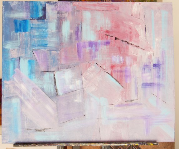
Day 21 WIP acrylic abstract, 30 paintings challenge


Untiltled WIP
Acrylic abstract painting
50x60cm on panel

Day 21 of Jan 2017 30 paintings challenge
Click Here to see Day 20's painting


I started this similar to yesterday's painting but coated the support with the flow medium first (I'm determined to find a good use for it). I used ceruleun blue, alazarin crimson and white. Due to the flow medium the paint was very 'squidgy' as I rolled and the imprint of the rollers was apparent. I decided to go with this and leave the pattern to take me forward. This was how it looked:


I added more paint keeping with the general shapes formed

So far not too bad - but then it went hay wire and resulted in the painting you see at the top. Not good at all, I somehow lost the way on this one. I shall see if I can save it as there are some elements in it that I like. I shall wait a awhile before I look at it again. Or maybe I will cut it up into smaller paintings and go from there.


You win some, you lose some...