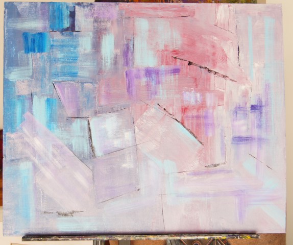
Showing posts with label 30 day challenge. Show all posts

31 January 2017

30 in 30 Collage

30 paintings in 30 days, January 2017 Collage

The challenge is over and I managed to paint every day.

My personal challenge was to experiment with abstracts and experment I did. I tried several different techniques from collage and assemblage through to intuitive works and onto drawing. I liked all of my works, although some were more successful than others. Now the hard work begins of assimmilating what I learnt and putting the final touches on my most successful paintings.

Thank you once again to Lesle Saeta for hosting the challenge, the rewards in participating outweigh the self-induced stress.

To peruse the other participants paintings vist Leslie's blog and have a peek.

Thank you all for following my progress.

29 January 2017

TOWARDS THE LIGHT WIP, Day 29 of the 30 day challenge

TOWARDS THE LIGHT
Work in Progress
2x50x60cm (overall 100x60cm - 40x24in)
Acrylic on gallery wrapped canvas

Day 29 of Jan 2017 30 paintings challenge
Click Here to see Day 28's painting
The underpainting:


I had an idea for this. I wanted lots of colour and raised swirls on this one. So  at this stage I went to the nearest town to see what I could find in the way of relief paint. The local art store was closed - it closes between 12:30 and 3pm for lunch - only in France! There is another store, part of a supermarket chain, that sells art materials, books and mixed media. Their art supplies are gradually dwindling but I did find some white relief paint. Triumphant I got ready to try my artistic swirls. The relief paint was TRANSPARENT not white. Ugh!

Undaunted I added more colour and, no surprises, I think it is turning into an abstract floral.

Will it become a floral? Or can I resist the urge and do something different?

By the way, does anyone know what to do with transparent relief paint?

26 January 2017

IMMUTABLE Pen and Wash Drawing - Day 26 of the 30 day challenge


Immutable
Pean and Wash
30x40cm (12x16in) on watercolour paper
Day 26 of Jan 2017 30 paintings challenge
Click Here to see Day 21's painting

Continuing yesterday's theme with pen and wash in a larger format. Instead of using Chinese ink (which is so so black) I used black watercolour for a much softer black. I paid good attention to composition rules, no shape the same size, interesting lines avoiding straight and parallel lines, variety of marks. Even so I still ended up with some similar repeated shapes.

Once again this was created in the evening sitting on the sofa and half-watching tv. I just managed to finish it as I stopped for an hour to actually watch SKY Portrait Artist of the Year. All nine contestants, a mix of professional and amateur, produced some stunning celebrity portraits. It's a genre I've always shied away from - Maybe that could be my next subject for September's challenge!


I decided I went a bit overboard with the wash, so I will tone down areas of the background wash.


I also washed over one of yesterday's paintings with yellow ochre to see what the effect would be:

Another interesting effect. Sepia ink instead of black, would also work well.

25 January 2017

INK STUDIES day 25 of 30 paintings challenge

My lack of motivation continued today. I played around with an idea I had but didn't take it far enough to post a painting. Last night I gave myself a strong talking to. I was looking through an exhibition catalogue of a Michel Gaudet (a French abstract painter) exhibition and that must have sparked something off.

While watching tv, I got out my watercolour pad, a Uniball micro pen and some water and started seeing what effects I could get.

This was the first

This was the second. Getting more complex

I loved the effect I could get just using the one pen. The ink dried very quickly and was waterproof once dry, but while it was wet it gave a lovely water colour effect.

On some of the lines I wet it and went back in with the pen to achieve some softer edge and spread the dissolve ink to give me the wash. The blots were created with cling film (food wrap) scrunched up and dipped in diluted chinese ink. The chinese ink is so strong, and very black and I would have liked the black areas to be less intense. A final splattering of ink finished it off.

Definitely an idea I can take forward.

Creativity is a funny thing - it is definitely enhanced by 'doing'.

24 January 2017

Colour Field Studies 2 - Blue, day 24 of the 30 day challeng


I ran out of steam a bit today. As they say life took over and my enthusiam dipped to a real low! I use a lot of blues in my paintings and wanted to explore different elements around that. This is all I achieved today. I have decided to move on and leave my colour studies until I have time to plan them properly. It is a fascinating subject in its own right and needs time and thought as well as the thinking time to absorb the effects.

With only a limited number of acrylics and mainly transparent ones, when I return to studying them, I will use oils which I can handle much better. Mind you, it would be a good excuse to do more art shopping for better acrylics. I think I need a range from open acrylics to heavy body.

One way to do these colour studies is to paint severL one colour sheets of paper and use those cut up and placeS on one another to see the effect before diving into the paint. Or, perhaps they could then be collaged together as references going forward.

I played around a bit with yesterdays two paintings:


Amazing what using a black or white border can do to youR perception of size as well as colour. The two right hand halves also show how lost edges can be created by colour with a similar tone. Just shows how when you DO IT, there is always something to learn.

23 January 2017

Colour Fields Studies, Day 23 of 30 day challenge


The beauty of doing something that is so far out of your comfort zone is it leaves you open to all sorts of new ideas and ways of looking at things. I never really understood colour field paintings but I have been looking at them just lately and I am starting to see more in them than I initially did. So for the next three days or so, I am going to see if I can make some sense of them for myself and I always want to learn more about colour.

I will be using NOT watercolour paper and acrylic. Today I started with analogous colours (groups of three colors that are next to each other on the color wheel) of yellow, orange and red. It may be the grey rainy day that influenced my choice!


This is the start of two of the studies. The background on the first is orange mixed with white. That resulted in this lovely coral colour, the second has a background of alazarin crimson which, in hindsight, is the wrong colour choice and will be changed.


Stay with me to see how this goes.

22 January 2017

Times Past Abstract Painting, Day 22 30 day painting challenge

TIMES PAST
Acrylic abstract
50x60cm on panel
Day 22 of Jan 2017 30 paintings challenge
Click Here to see Day 21's painting
The title was suggested by my husband. I didn't think he would see anything in this painting, but it's amazing how much he can see in some paintings despite his colour blindness. In fact he very often sees things I don't notice, perhaps because of his colour blindness, he sees the patterns more clearly.

I wanted a combination of texture and blending on this one. Having given up on the texture gel, I used heavy gesso in two areas and scored it with lines and circles. I had the idea of rocky shores maybe with blue above and blue below - sky? sea? I was quite pleased with the texture.


I used white, yellow ochre and alazarin crimson as in Day 20 and rollered that after spritzing the support with water. The alazarin crimson settled nicely into some of the grooves. After adding more white diagonally across, I added blue followed by quin. gold to enhance the grooves.


I then started to scumble various colour combinations over the whole area. Back and forwards for a longgggg time. I added orange into the mix to give more of a golden colour. I felt darks were needed so added some alazarin crimson mix with a tiny bit of black. Oh that was so dark and I lightened it a little. Not sure if that was the right decision. Scumbling takes a lot of time but there is something satisfying about watching the subtle changing of the colours but it's really hard to know when to stop!

I am quite pleased but some more scumbling is needed to meld the colours more and maybe I will lighten the blue. 

This is a concept I can take further for several paintings, but using plaster to create a thicker texture


21 January 2017

Day 21 WIP acrylic abstract, 30 paintings challenge


Untiltled WIP
Acrylic abstract painting
50x60cm on panel

Day 21 of Jan 2017 30 paintings challenge
Click Here to see Day 20's painting


I started this similar to yesterday's painting but coated the support with the flow medium first (I'm determined to find a good use for it). I used ceruleun blue, alazarin crimson and white. Due to the flow medium the paint was very 'squidgy' as I rolled and the imprint of the rollers was apparent. I decided to go with this and leave the pattern to take me forward. This was how it looked:


I added more paint keeping with the general shapes formed

So far not too bad - but then it went hay wire and resulted in the painting you see at the top. Not good at all, I somehow lost the way on this one. I shall see if I can save it as there are some elements in it that I like. I shall wait a awhile before I look at it again. Or maybe I will cut it up into smaller paintings and go from there.


You win some, you lose some... 


20 January 2017

'SAMURAI' Acrylic Abstract, Day 20 of 30 day Challenge

'SAMURAI'
50X60cm (20x24in) acrylic on panel
Day 20 of Jan 2017 30 paintings challenge
Click Here to see Day 19's painting

Going larger and being bolder in my approach.

Today I wanted to practice blending. The Golden Fluid acrylics dry so quickly that blending with them is out of the question unless lots of water is used which results in a thin film of paint. I managed to get hold of some Liquitex acrylics in our small town which I know have a longer 'wet' time (is that even a term?). Another new technique for me was using a roller.

I squirted some white, yellow ochre and alazarin crimson onto the board and rollered them to death for my base.

The start - as you can see I repurposed an old painting again


I wanted a dark area somewhere in the middle but did not want to use black, so I used cerulean blue and alazarin crimson. Unfortunately this resulted in a bit of a mess not my perfect bluey purple vision.

How did I hide this? by adding more colour of course! This was another painting that evolved as I went along - what a lot of fun but a nightmare at the same time.

A close -up


My husband - a confirmed "I don't like abstracts" person - paid me the ultimate complement on this one by asking me not to sell it as it 'spoke' to him.

19 January 2017

RIFT Abstract Painting, Day 19 of 30 day challenge

RIFT
Acrylic abstract painting
30x40cm on MDF canvas panel


Day 19 of Jan 2017 30 paintings challenge
Click Here to see Day 18's painting
This painting started out similarly to yesterday's painting but using the cut offs from piece of water colour paper I used. I pasted these on the edges of a panel. I mixed some gel medium into so modelling paste in the hope it might make it more firm. I wanted the make round indentations into the paste, it worked to a certain extent - you can see some of the indentations in the following photo.
I painted the textured area a deep blue and dropped pure orange, yellow and red into the indentations. After creating some streaks on the paper and adjusting the blues in the central area I called it done.

This could go anywhichway. Which orientation doe you think looks best?
 

18 January 2017

Quick Getaway Abstract, Day 18 of 30 paintings challenge

QUICK GETAWAY
Acrylic abstract painting
Day 18 of Jan 2017 30 paintings challenge
Click Here to see Day 17's painting
I started off this painting with the idea of a smooth middle section and highly textured top and bottom section. I ripped some NOT watercolour paper to give bevelled edges and used that as the middle strip.
I created a vertical texture in the top third and a slanted texture with a palette knife at the bottom. This gave a large area at the bottom but it all had a similar texture, so, again with the palette knife, I made one part rougher than the rest. Again, to break up the remaining larger bottom left hand section I put in circles of white paint in a diagonal direction. This is where it was at the end of the day.

The textured area was not as textured as I wanted but decided to see what I could do with it. I added more colours at the top, spritzing it a little in the hope that it would pool at the top of the ripped paper. I did the same with the lower rough areas using stronger paint. The colours I used were  Quinacridone nickel azo gold and teal and I was mindful that I wanted a muted effect. Staying with these two colours, I added circles to link the upper and lower sections using a bottle top. I needed some smaller circles but could not find anything to use. My husband came to the rescue with a ring spanner, et voilà the painting was finished (I think!).

After looking at it for a while I saw a ski slope with skiers queing up to ski down. What do you see?

Close-ups of the texture


17 January 2017

Possibilities Oil Painting Abstract Day 17 of Jan 2017 30 paintings challenge

Possibilities Abstract Painting
Oil on 6x8in box canvas

Day 17 of Jan 2017 30 paintings challenge
Click Here to see Day 15's painting
 
Today I am cheating a little. This is an abstract I painted a few months ago from paint left on my palette. You can see my favourite colours in this teal, purples and pinks.
 
I started two abstracts today but could carry neither of them further. I researched modelling paste and how to use it on the internet and then went out to purchase some with a firm idea of what I wanted to try. Well... the paste was way more fluid than I expected it to be, I expected a thick, grittier paste but what I had purchased did not have as much body as my gel medium. I couldn't really sculpt it at all and it took a day to dry, knocking my plans awry. Does anyone have experience with modelling paste? The only modelling paste I could find in our local town was Pebeo in a tube.

This is where I ended yesterday's painting I wanted to try a toned down colour scheme to take me out of my comfort zone:


16 January 2017

Turmoil, Miniature Abstracts set of 4 Day 16 of 30 day challenge

 Turmoil 1
 Turmoil 2
 Turmoil 3
Turmoil 4

Day 16 of Jan 2017 30 paintings challenge
Click Here to see Day 15's painting

Four 4x4in paintings for the price of 1 today.
I enhanced yesterday's paintings and and created two more.

Complete disasters all four of them. Not sure if I can salvage any of them.

14 January 2017

Work in Progress Day 14, 30 day challenge

Work in Progress
40x50cm (12"x16") acrylic on mountboard

Day 14 of Jan 2017 30 paintings challenge
Click Here to see Day 13's painting
A complete change of pace today. I found this forgotten abstract at the bottom of a drawer and I liked the way the shapes danced across the page. I had the idea I could change it to an autumn scene and call if falling leaves.


I coated the mount board with pale cream and added my shapes.
I watched another Nicholas Wilton video about Differences and Spontaneity and one of the techniqes he used was transferring paint using a transfer technique by painting on a piece of greaseproof paper and laying that on the painting. I loved the broken effect and it contrasted nicely with the larger flat painted shapes.


Oh! way too busy and too much blue. One thing I didn't consider was a quiet area versus the busy areas...

A little better.


Where it's at now. Getting busy again and the larger shapes are more or less the same size. Maybe I need to make one of them eg the red one, super large. I also have the urge to coat the whole thing with transparent white and put in some verticals. Maybe like this-

Something to think about...


13 January 2017

Pathways, Day 13 - 30 paintings in 30 days challenge


PATHWAYS
40x50cm (12"x16") acrylic on mountboard

Day 12 of Jan 2017 30 paintings challenge
Click Here to see Day 12's painting
Sticking with the texture and curves today, although I did start out with the intention of having verticals and no curves, and I'm back to my reds and oranges. It must be the cold snap we're having that I need to feel warm. Once again the painting evolved as I went along.


I scraped my palette clean and some large flakes of acrylic came away. I had the urge to stick one on the painting. Some teal paint on the palette from my previous painting popped through the flake and suggested the teal colour. And, as they say the rest is history. Can you spot the skins? There are actually two of them.

12 January 2017

In the Deep Acrylic Abstract Painting, Day 12 of the 30 paintings challenge

IN THE DEEP
30x40cm (12"x16") acrylic on water colour paper

Day 11 of Jan 2017 30 paintings challenge
Click Here to see Day 10's painting

Today I wanted to explore blending combined with the texture from day 9's painting. I also liked the blue/green scheme in that painting so went with that.

I gave the paper a coating with white acrylic paint which provided a nice slippery surface for blending. My blending technique needs working on as the acrylics do not behave like oils! I discovered I have a natural tendency to veer towards the sweeping curved lines so went with that.

I love the feeling of placing the dark paint mixed with gel medium on the paper with a palette knife. The result is unpredictable and gives a painterly feel without much work LOL. The way the paint sticks, including the accidental touching of the paper with the paint suggests how the painting should progress. Sorry no progress photos today - too busy painting.

Not a bad effort but after seeing the uploaded photo maybe I should add some purple/violet to offset all those cool colours. What would you do?

Foot note: After looking at this again, I think I will crop it and add purple (used photoshop to see what it would look like).

10 January 2017

During the Storm, Acrylic Abstract Painting, Day 10, 30 paintings in 30 days


DURING THE STORM
30x40cm (12"x16") acrylic on panel

Day 10 of Jan 2017 30 paintings challenge
Click Here to see Day 9's painting 
Continuing today to explore the properties of the fluid acrylics. I have deviated from my orange them
Today's painting is on reused mount board that used to be a floral still life. The surface had tissue applied to it that gave it an interesting texture. I coated it with with paint and cut the board in half giving me two 30x40cm supports.
Here is the original board before I cut it in half, you can still see the ghost of original painting

I put an initial layer of paint down, spritzing it and letting it run every which way.

I thickened some black acrylic with gel medium to give me a thick paint which I applied in a rough line across the top with a palette knife. (I don't know why I didn't think of using gel medium on yesterday's painting). This worked amazingly well, the mixture was nice and juicy to work with and the fluid acrylics have great pigment density so I only needed a drop or two in the gel medium.
 
I then enhanced the black with impasto blues and purples and some grey which is not easy to see. Below this impasto layer I again added more paint, spritzed some of it to make it flow. This was a process of to and fro until I had a good mix of soft and strong paint with the colours feeling right - that unidentifiable moment when you know it's going well.

A final flourish was the swathe of green across the black. 

This was an enjoyable process and it was one of those times when the paint and my thoughts were working together. It is certainly a concept I can take further and also scale up.