Showing posts with label orange. Show all posts

21 February 2017

Off to visit the rhinos and elephants

Coastal Morning
Namibia Impressions Series
50% of proceeds go to Save The Rhino Trust Namibia


As you read this I will be in Namibia visiting the rhinos and elephants again. Or at least I hope so. We were there two years ago at the same time of year - THE RAINY SEASON. That time we were lucky (well for us not the locals) as the drought was in full swing. This meant that the animals would all congregate around the waterholes making it much easier to spot them.

This year the drought has broken and it is much wetter, although it seems to be easing up so we may not get as wet as we first thought! This of course means that the animals will be more widely dispersed and more difficult to spot, but we are still hopeful.

This time round we are taking in the Savuti Channel and going into Chobe national park in Botswana. Keep your fingers croseed for us.
Namibia Impressions Series
Coastal Heat
12x12inch

09 October 2014

Autumn Quiet oil painting

Autumn Calm oil painting
With a nod to Emil Gruppe
Oil on 3-ply wood gesso panel
20x30cm (approx 7x12inches)
Available on Daily Paintworks

I came across a painting 'Autumn in Vermont' by Emil Gruppe and loved the light he captured in it.

I roughly sketched in the composition and continued the painting without looking at the reference as although influenced by him, I wanted this to be my painting.

About this painting
I am starting a love-hate relationship with this surface. It is so smooth. I usually like to work on a textured ground and, although I added an additional layer of gesso, it was still quite smooth and very absorbent. I was fighting the board a bit and so resorted to using a brush in combination with the knife. The paint also dries much quicker on this surface. It is brilliant white, and although I used a multicoloured underpainting (cool colours for dark areas and warm colours for light areas) I think the painting has a nice luminous feel to it.

Some Close-ups


And how it would look framed

06 August 2014

Paintings that talk to you - Sunset Glow at the Vineyard palette knife oil painting

Sunset Glow at the Vineyard
Palette knife painting
Oil on MDF canvas board, 24x30cm (approx. 10"x12")
Available on Daily Paintworks
website
This painting was started during the September 30 day challenge. It was slightly larger than many of the other paintings in the challenge. After the challenge I put it aside as I there was something I didn't like, but could not put my finger on it. 
The other day I looked at it again and suddenly it was clear what it needed to be finished. It was as if the painting was now ready for the final touches! Please keep this to yourselves as I don't want to be locked away for talking to paintings LOL.
See the WIP painting from the challenge HERE

Newsletter
My next newsletter will be going out in a few days time. Sign up to receive a copy and discover my latest paintings and a surprise treat.

Subscribe to my mailing list

* indicates required

21 February 2014

Tango Tangerines Still Life Painting in Oil

Tango Tangerines by Marion Hedger
Still Life painting
Oil on MDF panel
Available  on DailyPaintworks

Another clementine painting, this time with a dark red/brown background. To keep the background translucent I mixed the paint with liquin. This was very effective and I think I will use this again. I also manage to keep the background from getting too heavy which is sometimes a problem for me. Different styles call for different approaches. When using my palette knife I generally like a highly textured thick background but I thought that would be too much for this painting.

12 February 2014

There's always one - Clementine Still life with vase oil painting

There's always one - Clementine Still life with vase
Oil on gessoed MDF panel
15x15 cm (6x6 inch)
Another still life with the clementines from my garden. This little vase is one I made when I took pottery lessons about 20 years ago. I'm sure that anyone who has ever done pottery has something similar - Iron oxide glaze at the top and cobalt blue glaze at the bottom, with the iron oxide glaze running. The excitement was to see how the iron oxide had run down the vase!

About this painting
This painting is painted with a brush. I'm trying to rekindle my brush skills as since using a palette knife it is my tool of choice.

I am not sure about the effect I've achieved. It seems quite static to me and I'm wondering if I should go over every thing with more paint. I'd be interested in your opinion

 See my last clementine painting here

01 January 2014

Cheat for day 1 of the January 30 paintings in 30 days challenge

Ikebana 4 - Burnt Orange Chrysanthemums
Oil on canvas panel
24x30 cm (approx 10x12inch)
Palette knife painting 
100€, international shipping included
I have just returned from spending the holidays with my family in the UK. I thought I might be able to pull something together tonight, but as usual for this time of year I have picked up a virus and I am feeling sorry for myself. So I am cheating and posting this chrysanthemum still life painting that was part of the November Wetcanvas.com floral and botanical forum challenge. It does fit, more or less, into the challenge to my self this month, to push my painting style further.

06 November 2013

Pumpkin and Avocados still life, oil palette knife painting

Pumpkin and Avocados still life
Oil on canvas panel, 24x18cm (approx 7x10inch)
Palette knife painting
80€ International shipping included

A friend of mine saw me looking at the pumpkins and squash at the local market. The next day she made me a present of a couple of pumpkins.
Unfortunately, we had already eaten one of them before I got around to painting doing the painting, so I used some avocados I had in my fruit bowl as a stand-in. But, as usually happens, when I paint fruit and veg still lifes, part of it disappeared before I finished the paintings. I had to do the final touches from memory.

Some close up crops of the knife work


28 October 2013

Update on Autumn Mist rework of Zorn Palette painting WIP

Autumn Mist WIP
This is the progress on my Autumn Mist painting. I have roughly placed in a dead tree on the left hand side by picking up any colour on my palette just to get the shape and see how it would look. I like the effect of this multi-coloured tree so may incorporate some of this in the final tree. My hubby says - "Why would you want a dead tree in a painting?" but with a bit of work I feel it may work.

Still a lot of thinking and painting needed on this painting. It's resisting most of my attempts to finish it LOL.

Read the previous update HERE

02 October 2013

Autumn Morning, Fall Landscape 10x12 inch

Autumn Morning
24x30 (approx 10x12inch)
oil on loose canvas
A different style for me. After the challenge I wanted something soothing to paint. I've had this photo for a while but normally don't do 'soft'. However, after the tutorials on the Zorn palette I decided to use some of the pointers picked up during the webinar. As you know, if you have read some of my earlier posts, I am not a fan of the Zorn palette, so I went with the colours I know.
Here is how it started out, first I had a pink ground and then massed in the shapes - definitely an ugly duckling stage

26 September 2013

Abandon, Autumn Abstract - Day 26, 30 days hath September, oil, 9x12 inch


Abandon, Autumn Abstract
23x30x1.5cm (approx 9"x12"x0.6")
Oil on box canvas, palette knife painting
 110€ International shipping included

I've just notice the three As in the title - a little unintended alliteration LOL

I felt like doing something a little different today and something where I could just use my paints with abandon. Working with the oranges, red and yellow really makes me feel happy. The inspiration for this one my previous painting
Autumn Explosion
Process
I started with a puple ground then some red dabs of paint, next I alternated with different orange hues and reds and lastly luscious cadmium yellow. After all the paint was more or less in place I used a palette knife to place the trees in position by laying the palette knife flat on the canvas and pulling it up through the paint.
Placing the trunks
The very last thing was to lay in the trunks with titanium white which I did with a sideways motion. The white paint picked up some of the colour already on the painting giving the illusion of bark. I tried hard to give the trunks different widths but maybe I should have made them much more different?
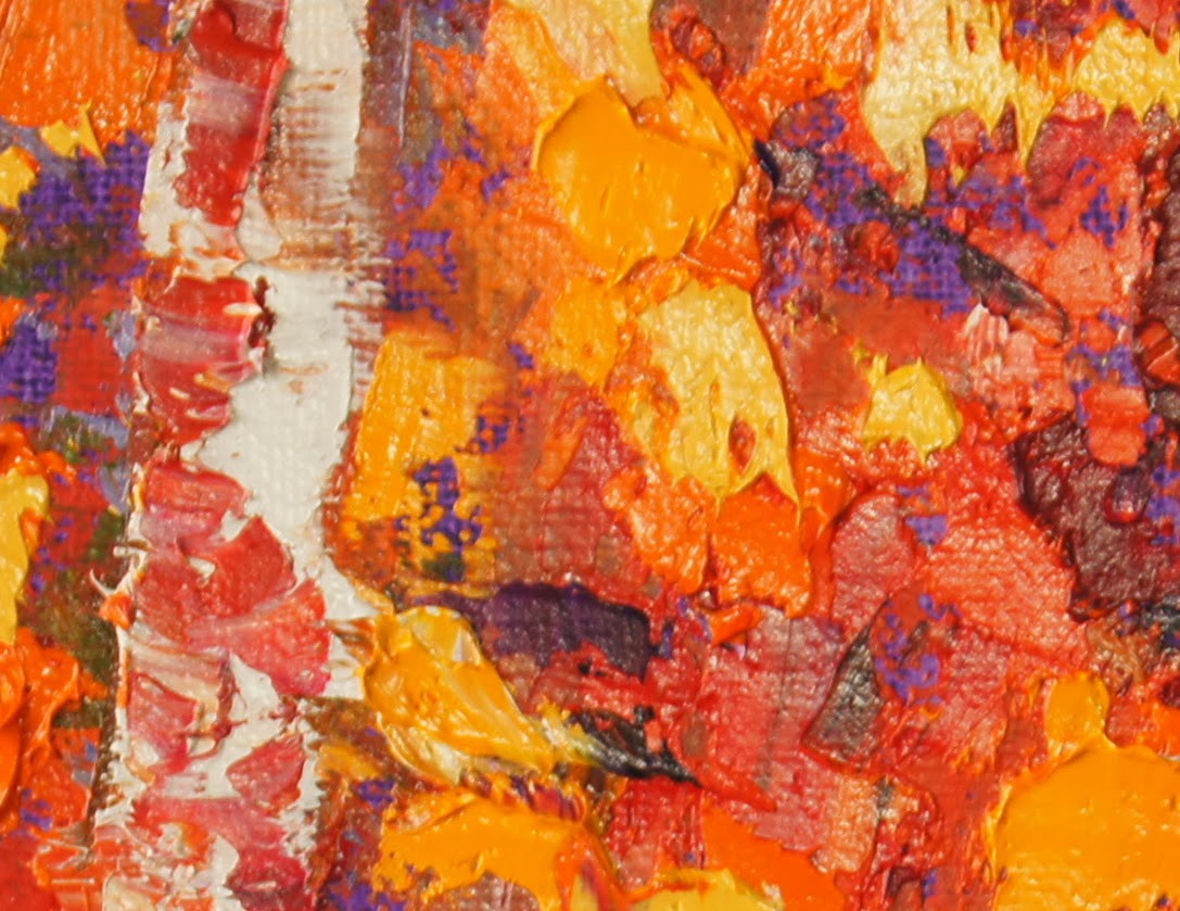
Knife work close-ups
Here are some close ups showing the different layers


15 September 2013

Autumn Blaze oil painting, Day 15, 30 days hath September challenge


Autumn Blaze oil painting
18x24cm (approx 7"x10")
THIS PAINTING IS SOLD
oil on canvas panel
palette knife painting
Day 15, 30 days hath September challenge

I have painted this scene before, see here and, as I like the vibrant colours, I thought it would it would be good to paint it again. I changed it a little to fit onto the smaller rectangular format as the original was a 30x30cm square format.
Tree colours as the focus
I made the focus of this one the trees and not the water/reflections.
I love all those oranges and yellows. I built the leaves up in layers using pinks, mauves and dulled orange as the first few layers to suggest depth and distance. I then used thicker and brighter oranges and yellows to suggest the closer leaves and sunshine on them.
Close up pics
Here are some close-ups of the knife work

02 September 2013

Autumn River - Zorn Palette

Autumn River
40x50cm (16"x20")
Oil on narrow box canvas
This is the second painting in the Zorn palette tutorial by Ken Vloothuis.
This demonstrates how a painting can be constructed using a narrow tonal range. I still need to work on some areas but overall I am becoming more comfortable with the Zorn palette although it is much more subdued than I am used to.

I am falling behind a little as I couln't paint along to this weeks webinar which is a snow scene. I aim to complete this over the next few days and I will post it when finished.

Here is the post to the first painting which is more colourful.

I'd be interested to read your comments about this. Do you find the colours harmonious or interesting?

09 May 2013

Autumn Vineyards in Provence Montage

Autumn Vineyard Provence Montage
by Marion Hedger

A montage of autumn vineyards in Provence. Painted after a visit to the vineyard in October.

See the individual paintings HERE
Available paintings are for sale in my Etsy Store

05 December 2012

Autumn Reflections Palette Knife painting

Autumn Reflections
Oil on canvas, palette knife painting
30x30 cm on narrow box canvas
This painting is SOLD

I love painting water and reflections. When I noticed this photo in my archive of wetcanvas.com photos, I thought AH-HA I must try that one while I am in autumn mode. It turned out colourful (but that is no surprise for me) but I like it. The water adds another dimension to an autumn scene.

Reflections Tip
Reflections should never be as bright as the original. One way to avoid this is to paint the reflections into the wet paint of the water. This ensures that the colours will always be dulled down.
 You might be interested in my Autumn Explosion painting

28 November 2012

Autumn Explosion, palette knife painting

Autumn Explosion by Marion Hedger
Oil on canvas panel
Heavily textured palette knife painting
18x24 cm (approx 7"x10")
When painting forest scenes, I usually like to show some sort of path to encourage the viewer to 'walk' through the painting, as can be seen HERE in this larger painting. With this painting, I wanted to show the 'denseness' of the foliage and the way that the colour can confuse the senses.

Here is a close up of the impasto knife work

This is a sister painting to Autumn Birches which was painted with the same palette and also shows a path.
 
 Find my small paintings in my ETSY STORE


02 November 2012

Golden Marsh Palette Knife Painting in oils

 Golden Marsh by Marion Hedger
Oils using palette knives
18x24cm (approx 7"x10") on Canvas panel
A study following Lois Griffel's method of painting. I have previously used Susan Sarback's process with pastels and this is the first palette knife oil painting using Lois's method which is a very similar process and way of thinking. I took her example photo and flipped it and changed some of the marsh detail. I like the sense of distance achieved and the light shining through. I shall try a few more of these but larger I think as working small is quite difficult.

THIS PAINTING IS FOR SALE IN MY ETSY SHOP

01 November 2012

Autumn Colours Abstract - sale benefitting the American Red Cross


Autumn Colours Abstract by Marion Hedger
Oil on box canvas
20x20 cm (approx 8"x8")
A lively abstract representing the colours autumn. Painted with a palette knife and a cut up plastic lid to give a smoother effect than my normal palette knife paintings.
Proceeds of the auction will be donated to the DPW Hurricane Sandy fundraiser for the American Red Cross, so please bid generously.
BID ON THIS PAINTING HERE

If you like autumn colours, take a look at Autumn Birches palette knife daily painting

If you like this colour combination but would like a larger painting with a similar scheme, please contact me HERE

31 October 2012

Autumn Birches palette knife painting in oils

Autumn birches
Oil on canvas MDF board
18x24 cm (approx 7"x10")

I am still on my 'using a palette knife' phase. After all the blue/violet paintings of the Provence landscape I have been painting autumn scenes using yellows and oranges trying to suggest the sunlight bouncing off of all that colour.
This is my first small mini daily painting of the colour changes.
This is available by auction on Daily Paintworks CLICK HERE TO BID

To see a larger autumn painting, "Autumn Light" please visit my Artbymarion blog

30 November 2011

Landscape Impressions I - Gouache painting

This is an ongoing project to extend my knowledge of gouache. I have always enjoyed ethereal watercolour paintings that suggest the information but with no detail. As I was playing around with the gouache I wondered if I could achieve that effect with gouache. Here is my first try:

 Landscape impression I  by Marion Hedger
12.5x17.5cm (5"x7") Gouache on canvas board
Purchase this unique painting HERE
I coated the canvas with a ground of dark orangy colour acrylic.  Then roughly mapped in the design with the gouache and gave it a spritz with water, turning the support now and again to let the paint run but generally letting it go where it wanted to.  I then worked back into it, ocassionally spritzing again. In the final pass I tried to recapture some of the highlights as these had sunk into the support and some areas were qute dull where the paint had run. It was difficult to know how much reworking to do and how much could be achieve with gouache. When finished I varnished it with spray acrylic gloss varnish which lifted some of the dulled colours.

I was surprised at how much I enjoyed working on the canvas as I thought it might be a little rough, but the gouache behaved well and it was stable enough to withstand the spritzing and the reworking and it had a nice feel to it while I was painting.

Not a watercolour 'ethereal' look, but I like the result. What do you think?